Mridul2820
.block{
padding: 2rem;
display: flex;
flex-direction: column;
align-items: center;
gap: 2rem;
transform-style: preserve-3d;
perspective: 1000px;
&__1{ //début block 1 //
position: relative;
width: 20rem;
height: 30rem;
box-shadow: 20px 20px 20px rgba(0, 0, 0, 0.2);
transform-style: preserve-3d;
transition: .5s;
&:hover{
box-shadow: 0px 20px 20px rgba(0, 0, 0, 0.2);
transform: rotateY(35deg);
}
&:active {
box-shadow: 0px 20px 20px rgba(0, 0, 0, 0.2);
transform: rotateY(180deg);
}
&::before {
content: '';
position: absolute;
width: 75px;
height: 100%;
transform-origin: left;
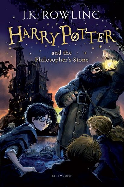
background: url(/img/harry-potter-sides.jpg);
background-position: center;
background-size: cover;
transform: rotateY(90deg) rotateX(180deg);
}
&::after {
content: '';
position: absolute;
width: 100%;
height: 100%;
transform-origin: center;
background: url(/img/Harry-potter-Back-Cover.jpg);
background-position: center;
background-size: cover;
transform: rotateY(180deg) translateZ(75px);
}
&-img{
position: absolute;
top: 0;
left: 0;
width: 100%;
height: 100%;
object-fit: cover;
}
} // fin block 1//
Book Mockup
Designed By MridulMridul2820
&__2{ //début block 2 //
    position: relative;
    width: 30rem;
    height: 45rem;
    top: 0;
    background: #fff;
    transform: rotate(-37.5deg) skew(10deg);
    box-shadow: -35px 35px 50px rgba(0, 0, 0, 1);
    transition: .5s;
    cursor: pointer;

    &-back{
        background: url(/img/floor-livre-2.jpg);
        background-attachment: fixed;
        background-size: cover;
        width: 100vw;
    }

    &:hover{
        transform: rotate(-37.5deg) skew(10deg) translate(20px, -20px);
        box-shadow: -50px 50px 100px rgba(0, 0, 0, 1);
    }

    &::before {
        content: '';
        width: 3rem;
        height: 100%;
        background: url(/img/bg-livre-2.jpg);
        position: absolute;
        top: 0;
        left: 0;
        transform: skewY(-45deg) translate(-30px, -15px);
        box-shadow: inset -10px 0 20px rgba(0, 0, 0, .2);
    }

    &::after {
        content: '';
        width: 100%;
        height: 3rem;
        background: #ccc;
        position: absolute;
        bottom: 0;
        left: 0;
        transform: skewX(-45deg) translate(15px, 30px);
        box-shadow: inset -10px 0 20px rgba(0, 0, 0, .2);

    }

    &-h2{
        position: absolute;
        bottom: 6.3rem;
        left: 2rem;
        font-size: 3rem;
        line-height: 1rem;
        color: black;
    }

    &-span{
        color: red;
    }

    &-writer{
        position: absolute;
        bottom: 2rem;
        right: 2rem;
        color: #262626;
        font-size: 1rem;
        padding-top: 11rem;
        border-top-left-radius: 1px solid #262626;
    }

    &-i{
        font-size: 1rem;
    }

    &-cover{
        position: absolute;
        top: 0;
        left: 0;
        background: url(/img/bg-livre-2.jpg);
        width: 100%;
        height: 70%;
        background-size: cover;
    }


} // fin block 2//
Design
Lorem ipsum dolor sit amet consectetur adipisicing elit. Dolor, odit!
Zak MANGUET
&__3{ //début block 3 //
    position: relative;
    width: 20rem;
    height: 20rem;
    cursor: pointer;
    margin: 1rem;

    &-face{
        position: absolute;
        top: 0;
        left: 0;
        width: 100%;
        height: 100%;
        transition: .5s;
    }

    &-face1{
        background: #dedede;
        display: flex;
        align-items: center;
        justify-content: center;
        z-index: 1;
        transform-origin: bottom;
    }

    &-img{
        max-width: 10rem;
    }

    &-h3{
        margin: 1rem 0 0 0;
        color: black;
        text-align: center;
        font-size: 1.6rem;
        font-weight: 700;
    }

    &:hover{
        .block__3-face1{
            transform: translateY(-100%) rotateX(90deg);
            background: red;
        }
        .block__3-face2{
            transform: translateY(0) rotateX(0deg);
            background: black;
        }
    }

    &-face2{
        background: white;
        display: flex;
        justify-content: center;
        align-items: center;
        padding: 2rem;
        transform-origin: top;
        transform: translateY(100%) rotateX(90deg);
    }

    &-text{
        color: white;
        line-height: 1.6;
        text-align: center;
    }


} // fin block 3//
Zak MANGUET
&__4{ //début block 4 //
    position: relative;
    width: 40rem;
    height: 50rem;
    cursor: pointer;
    background: rgba(0, 0, 0, .1);
    transform: rotate(-20deg) skew(20deg) scale(0.8);

    &-img{
        position: absolute;
        width: 100%;
        height: 100%;
        transition: 0.5s;
    }

    &:hover{
        .block__4-img{
            &:nth-child(4) {
                transform: translate(160px, -160px);
                opacity: 1;
            }

            &:nth-child(3) {
                transform: translate(120px, -120px);
                opacity: .8;
            }

            &:nth-child(2) {
                transform: translate(80px, -80px);
                opacity: .6;
            }

            &:nth-child(1) {
                transform: translate(40px, -40px);
                opacity: .4;
            }
        }
    }

} // fin block 4//